Day 1 - 12 June 2017
We're turning 2D materials into 3D objects. We started by making a pattern to cover a sweet potato.

Sweet potato pattern 1.jpg

Sweet potato pattern 2.jpg
We started work on a waistcoat project. Working with Lauren, we sketched a simple design and measured one another in cm:

Waistcoat design.jpg
We drew and cut out a basic shape using our measurements, then shaped it on our bodies to make a “sketch model”.

Sketch model.jpg

Sketch model 2.jpg
From our sketch model, which had no seam allowance, we drew out a final pattern with proper markings for seam allowance, darts, notches etc.

Marked up pattern.jpg
We tie dyed the fabric we were going to use for our waistcoats, using indigo.

Indigo.jpg

Tie dye 1.jpg

Tie dye 2.jpg
With dry fabric, we could pin and cut our patterns, making design decisions about whether to keep to the true of the grain or to use the “best” bits of our tie dye.

Cutting 1.jpg

Cutting 2.jpg

Cutting lining.jpg
We needed to mark all the darts, so I chose to use a tight tack whilst others used loose tailor's tacks. I had to form all of the darts as the first operation, before any of the pieces could be joined together.

Back darts.jpg

Lining darts.jpg
I chose to assemble my waistcoat in a way I have used many times which works best for a fully lined garment and means there is minimal finishing after construction. I “bagged out” the 2 front panels and the back by stitching the necklines, armholes, hemlines (leaving a gap centre back) and front edges.

Back bagged out.jpg
I then inserted the front pieces inside the back piece, right sides together, and stitched the shoulder lines and side seams. The finished waistcoat could then be turned out through the gap in the back hem and only requires a short section of hand stitching to be finished. With time, I would add buttons and buttonholes.

Waistcoat front.jpg

Waistcoat back.jpg
(Competencies: T.D.3.1, T.D.3.2, T.D.3.3, T.D.3.4, T.D.3.5, T.D.3.11, T.M.3.1, T.M.3.4, T.M.3.5, T.M.3.6, T.M.3.7, T.M.3.9, T.M.3.11, T.M.3.12, T.M.3.13)
Day 3 - 4 July 2017
We
did some quick sketches, aimed at getting a figure down, but also
giving restrictions that mean you're not completely in control of the
drawing so you stop being precious (time limits, not looking, using
your “other” hand, etc.).

Timed
figure sketches.jpg
We
also had a go at focussing on the garment (with or without a figure)
and trying to show that it is made in a material that has drape and
movement. Details, seams, folds, etc. adre important to communicate
what the garment is like and how it might be made.

Quick
garment sketches.jpg
We
moved onto looking at some “smart” materials, ones that warm or
cool the body, biomimetic ones, fabric with microencapsulation of
scents, colour changing dyes that are thermochromatic, photochromatic
or hydrochromatic.
Sarah
has some thermochromatic inks, so we made a tester sample and a
“teaching aid” colour-change t-shirt to try these out. If I were
going to use these with a class, I'd need to do a lot more practising
myself so that I could advise them on what will give a good effect –
I was pretty disappointed with what I came up with! Once dried, the
inks just made murky colours that didn't change dramatically when
heated up. Or, as with my t-shirt, the photochromatic ink did not
fully cover the design underneath so it kind of loses the element of
surprise.
It
seems that mixing the colour-change ink with a base colour, as some
others in the group did, is more effective than covering one with the
other. Then, when the heat makes the thermochromatic pigment
“disappear” the base colour returns and it can be quite dramatic.

Photochromatic.jpg
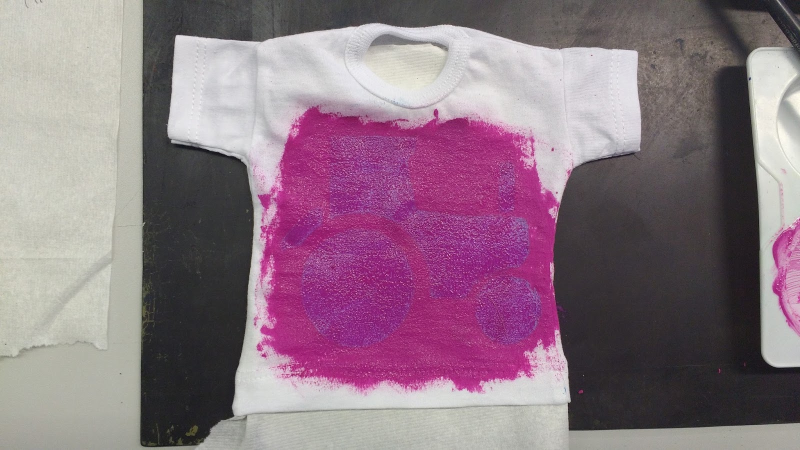
Photochromatic
t-shirt.jpg
I
made a couple of sample using the heat transfer technique. Firstly
using fabric crayons:

Fabric
crayons.jpg
I
was pleasantly surprised by how bright the crayon one came out. I
used polyester voile and put rough sandpaper under my drawing paper
to give more texture. I noted that the blue came out much stronger
once printed, and the yellow became much more vivd. For future, I
would remember to brush off as much crayon “dust” as you can
before you print, otherwise you get little melty spots everywhere.
Then
I had a go using transfer paper with some leaf skeletons:
Transfer
paper.jpg
Leaf
transfer crystal voile.jpg
I'm
not sure why, I think it's the crystal voile, but the transfer colour
seemed to bleed a lot more than I expected, so the leaf silhouette is
pretty faint. To be confident I could get the effect I wanted using
transfer paper, I would have to do some more testing and practising.
Finally,
we were able to use the sublimation printer process – printing an
image onto special paper using special gel inks and then heat
transferring onto fabric. Printing like this works best onto
synthetics because it is about covering the surface of the fibre
rather. I made two main mistakes: 1. I didn't reverse my pictures
before printing, so they printed in reverse (which didn't really
matter because there's not writing, but I knew they were wrong). 2.
I didn't mask under or around my print area, so my t-shirt print went
through onto the back layer of the t-shirt and my Bear picture got
shadows around it of previously printed stuff that was left on the
print bed.

On
paper pre-printing.jpg

Green
eggs t-shirt.jpg

Bear
print.jpg
(Competencies:
C.6, C.7, C.12, T.D.3.6, T.D.3.8, T.D.3.9, T.D.3.10, T.M.3.1,
T.M.3.2, T.K.3.4, T.K.3.6)
No comments:
Post a Comment
Note: only a member of this blog may post a comment.